The new face of YTV
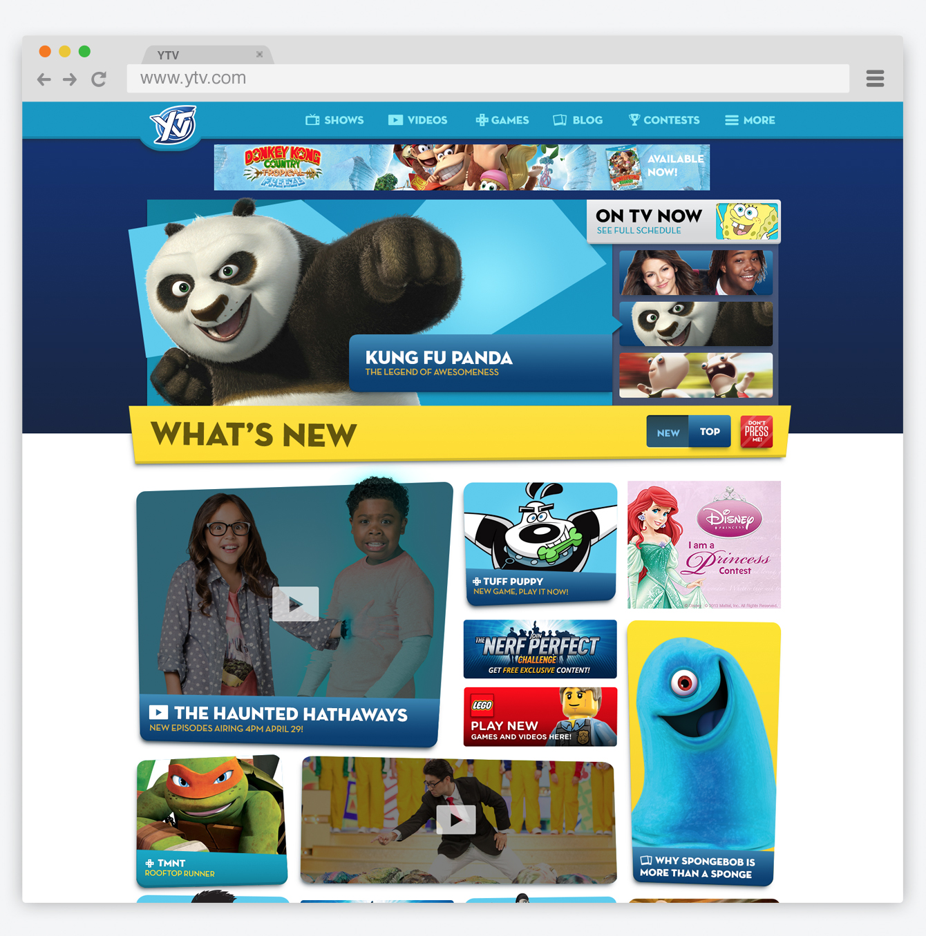
YTV is the leading a broadcaster and creator of original programming in Canada. They came to Playground in 2014 for help creating as dominate a brand online as they had on tv. We designed an easy to use site with a focus on fun, strong branding and content discovery. While working with the team at Playground I had many roles on this project including strategy, UX planning, UI design, Project Management and content creation.
Dynamic Theming
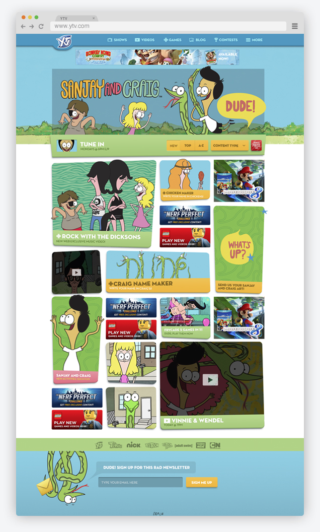
We discovered early on that the audience recognized and navigated by individual shows and characters rather than by categories or site sections. Additionally many users wanted to engage only with content from their favorite shows. We accommodated this by designing a fluid theming system that allowed the site to match the brand of the various shows. This system also extended to promotions and monthly events.
Simple & Engaging
While the YTV hub is a large site we wanted kids to easily learn to navigate to the content they care about. We devised a plan that had the entire site based on two key layouts that we called the "hub" and "content overlay". With this design kids could easily navigate to and from content quickly, encouraging them to explore more of the site.
Content Overlay
We made every content page an overlay that promoted faster loading and allowed users to go back to the hub page without losing their place. In this way users would engage with more content and spend more time on site.
Dynamic & valuable advertising
The YTV site is monetized entirely through advertising and we wanted to make the ad placements as engaging for users as they were valuable for brands. We also wanted users to easily distinguish content from ads. We created several custom ad units and takeovers along with more traditional ad units to give the sales team a dynamic offering.


