Creating a cloud first gaming controller
I was the lead designer for the Stadia controller and input program for Stadia. This meant designing everything from the physical UX of the controller, the software that powers it and philosophy and strategy of input as a whole. The Stadia controller was the first of its kind, a wifi controller made from the ground up for streaming games. Get one from the Stadia store.
A controller is about the buttons
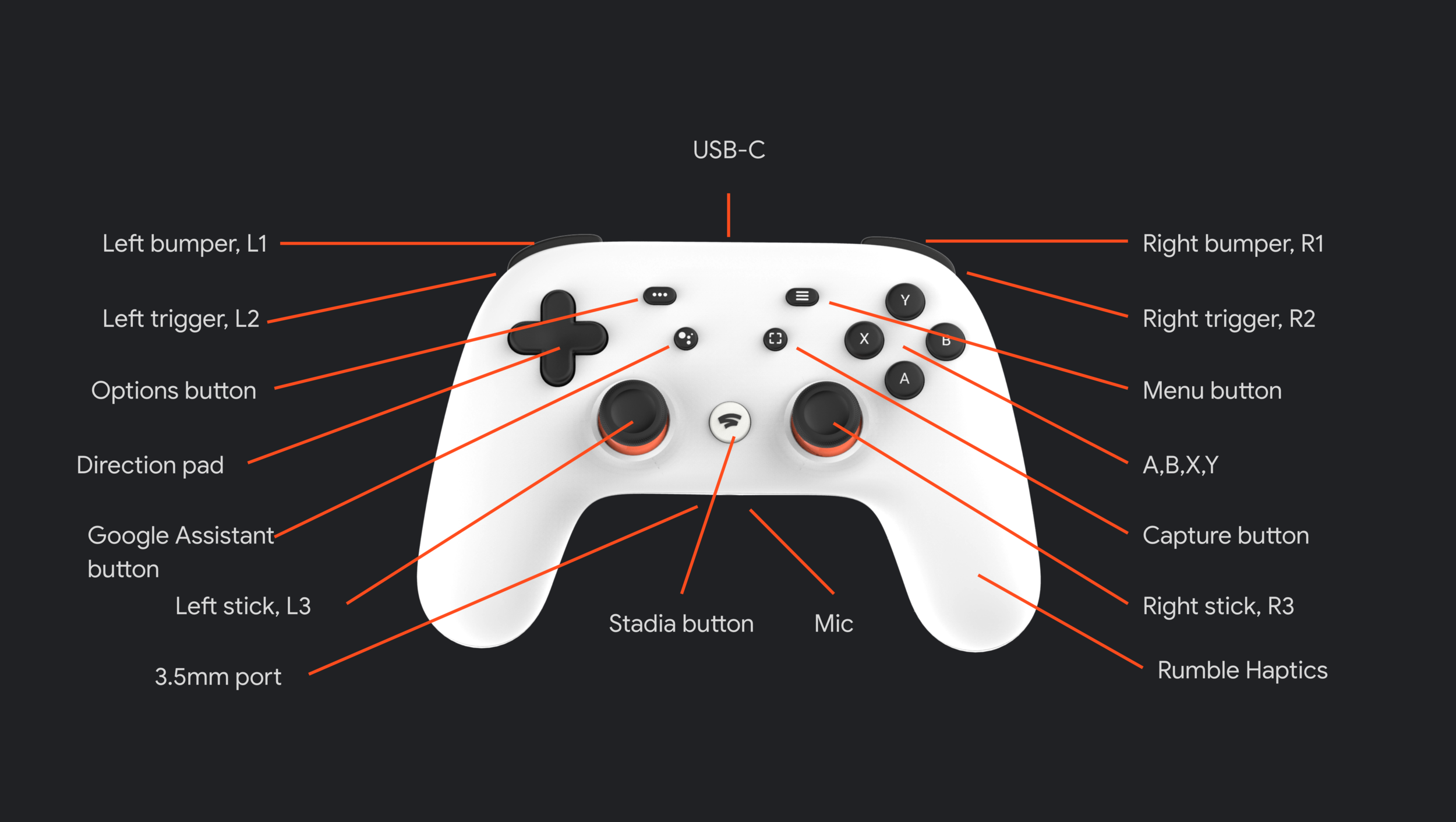
We explored a number of iterations for the buttons to include on the Stadia controller. We settled for a standard layout with special buttons for captures, Assistant and Stadia home. I pushed for Stadia to support a wide range of 3rd party controllers so it was important to me that our controller felt familiar among them. For that reason I stuck with the popular A, B, X, Y button labels used on PC and Xbox controllers.
Stadia lets you play on any screen, your controller needs to also
The core challenge of the input project was solving for how you would link your controller to various screens. Without using Bluetooth we needed a method to quickly connect to a PC, Mac, iPhone, Android phone and Chromecast, as well as any other future endpoint. I developed a concept using a linking code with a web service and worked closely with senior engineering to prove it out. This linking service became the core backbone of our controller and was awarded a patent.
Linking is cool, but automatically linking is better
While the linking code system was effective it wasn’t something that we wanted users to do all the time. I developed an auto-linking system that would allow the controller to automatically connect to the last played screen when turning on. In the case of Chromecast this would also turn on the TV and launch the Stadia app.
It was very complicated to make the controller simple
The controller has a lot of unique functions and edge cases that needed to be supported. Making all of them easy to understand without instructions was not easy. I developed multi-button combinations along with hold durations that tested well with users, making the controller intuitive to new users while rewarding our pro users.
Making power management easy
I developed the battery system including the notifications shown when a controller is low on batter, about the die and charging. In addition I developed the LED and states used while charging.
USB priority
The controller can be used through USB, which created a lot of complex interactions with its wireless states. I developed the USB hierarchy which controls what state the controller is in while plugged in.
Audio and safety
The Stadia controller supports headphones through USB-C and 3.5mm ports. I developed the UX around using headphones along with controls and notifications to prevent the user from damaging their hearing.
Controller menu
This menu is found on all our play endpoints and is the primary way to manage and links various controllers, including 3rd party controllers. It also lets you see battery states, headphones and linked controllers.
Haptics play a critical role in the UX of the Stadia controller
We used haptics for more than just in game events, they are critical to communicating the controllers state. I developed a haptic language that was intuitive to users, and when paired with LEDs would help them understand the state the controller was in. I prototyped and specd out each haptic state and worked with engineering to get the timings and intensities just right.
The LED was simple, but needed to do a lot of work
The LED ring around the home button was critical to convey the various states of the controller. In particular it was needed to describe the many states that the controller could be in during linking or setup. I specd out all the states and did extensive user testing to ensure they were easy to understand. I eventually settled on a two color system that was eventually adopted by all of Google.
Input was about more than the Stadia controller
Input on Stadia went well beyond the Stadia controller and incorporated supporting all input devices such as 3rd party controllers. I pushed our leadership to embrace these devices and it became a core party of our strategy. I worked to ensure that these controllers were first class citizens, even going so far as to ensure that icons used in game correctly matched which device you are using.
Touch is our next big frontier
Shortly after the launch of Stadia I pushed for us to focus on our mobile play experience. I worked closely with engineering to develop a touch controller prototype which worked so well in testing that it quickly went live. It was a huge success with players and the press and drove our mobile play numbers to be hundreds of times higher. We are currently working on ways to expand our touch controller.


