Traveling to new worlds is my favorite part of VR
One of the main reasons I love VR is for its ability to take you to amazing places. When I joined Daydream the team had no one working on environments for our many apps and had very limited insight into what would make a good environment. I hired artists, build tests, conducted research and became a subject matter expert on the topic. I wrote the guidelines and worked with our artists to create almost every environment for our launch apps. I put some of my insights together and gave them as a Google IO talk just prior to the launch of Daydream.
I started by developing principles that would guide our work
VR was new to all of us, so the best way to understand what worked was to create prototypes. I developed dozens of environments and tested them with hundreds of people. This allowed me to quickly develop a set of principles that would guide all our environment work.
Focus on natural outdoor spaces and buildings open to nature
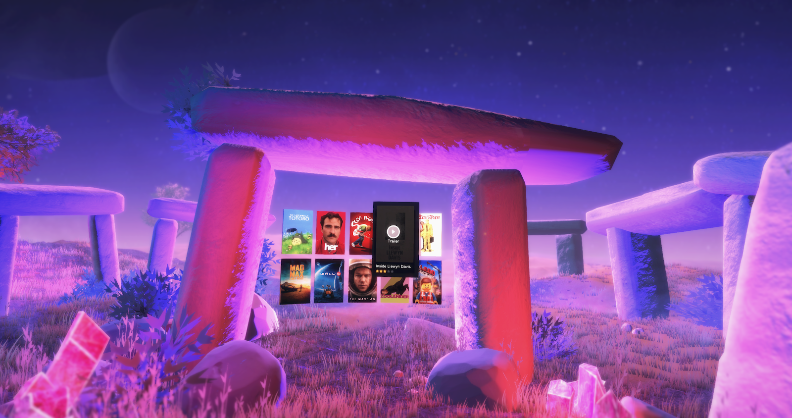
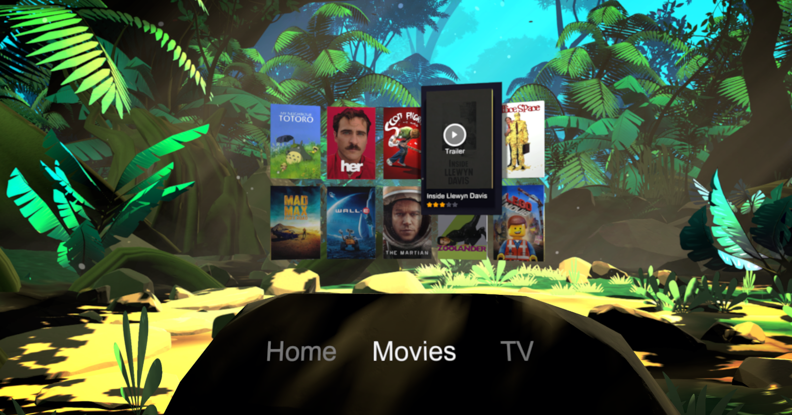
While building an identity for Google environments we tried many things. What we discovered is that the most compelling spaces were often natural environments and idyllic landscapes. Not only were these spaces awe inspiring, soothing and widely loved, but they fit Googles brand. To make them just a bit more Google, we often added in lit bits of magic and color.
When crafting buildings, we decided to have them open to nature. In VR, buildings have no need to protect you from the elements or provide shelter, so it made sense that they would be open.
Daydream home was our most ambitious environment
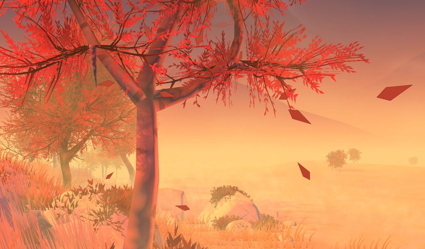
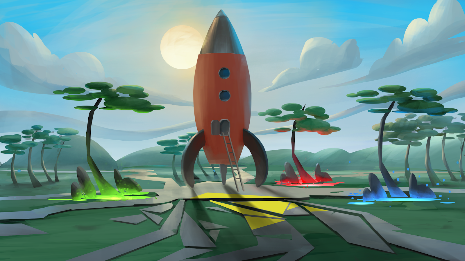
While most environments for Daydream where made using ODS images we knew that we wanted the Daydream home world to be more sophisticated. Our goal was for it to be more alive and interactive. Sticking with our natural theme we explored a low poly look which would be unique and work within our render budget. I worked with an amazing artist named Darin Hilton who built this world from concept to production.
Projection mapping
In order to have this complex of a scene we needed to use all the tricks. Using projection mapping we were able to get a scene with complex looking lighting and geometry.
Optimize everything
Even with all the extreme effort to optimize, the home world needed more. Many meshes were reduced by 70% and all extra faces were removed.
Focus on the foreground
Some close up key objects were textured using traditional atlas textures. Most of the details were near the user, where almost everything else was baked into the skybox.
Bringing it to life
The world had many objects such as flying birds, a running stream and floating particles that brought it to life. Each of these were done in very optimized ways.
Other home world explorations
The Daydream home world went through many iterations. I worked with our artist Darin Hilton to develop ideas and pitch them to leadership. I was developing the UI for home world at the same time which helped us think of ways that the UI and world could work together.
Telling a story with the play movies environment
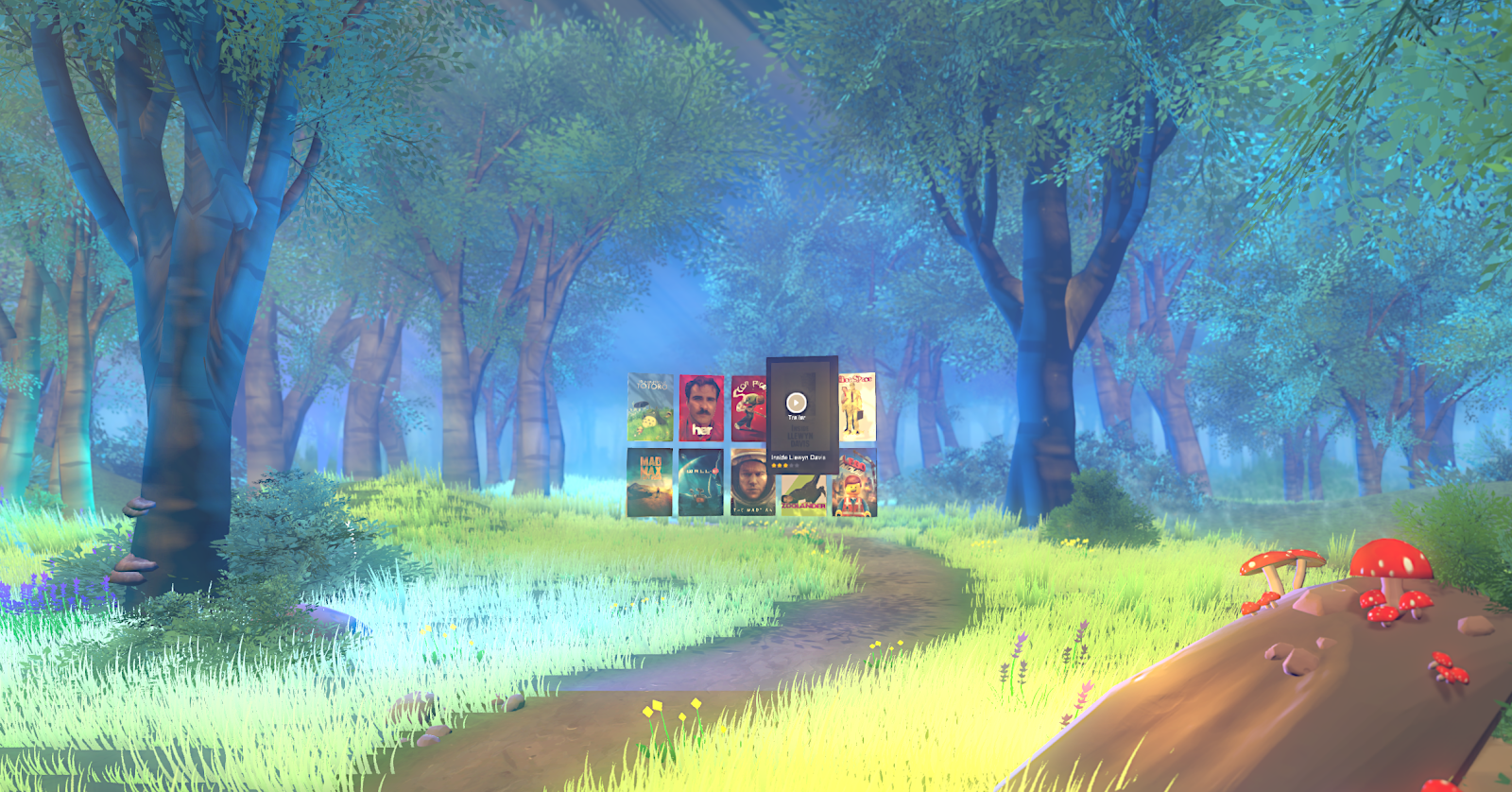
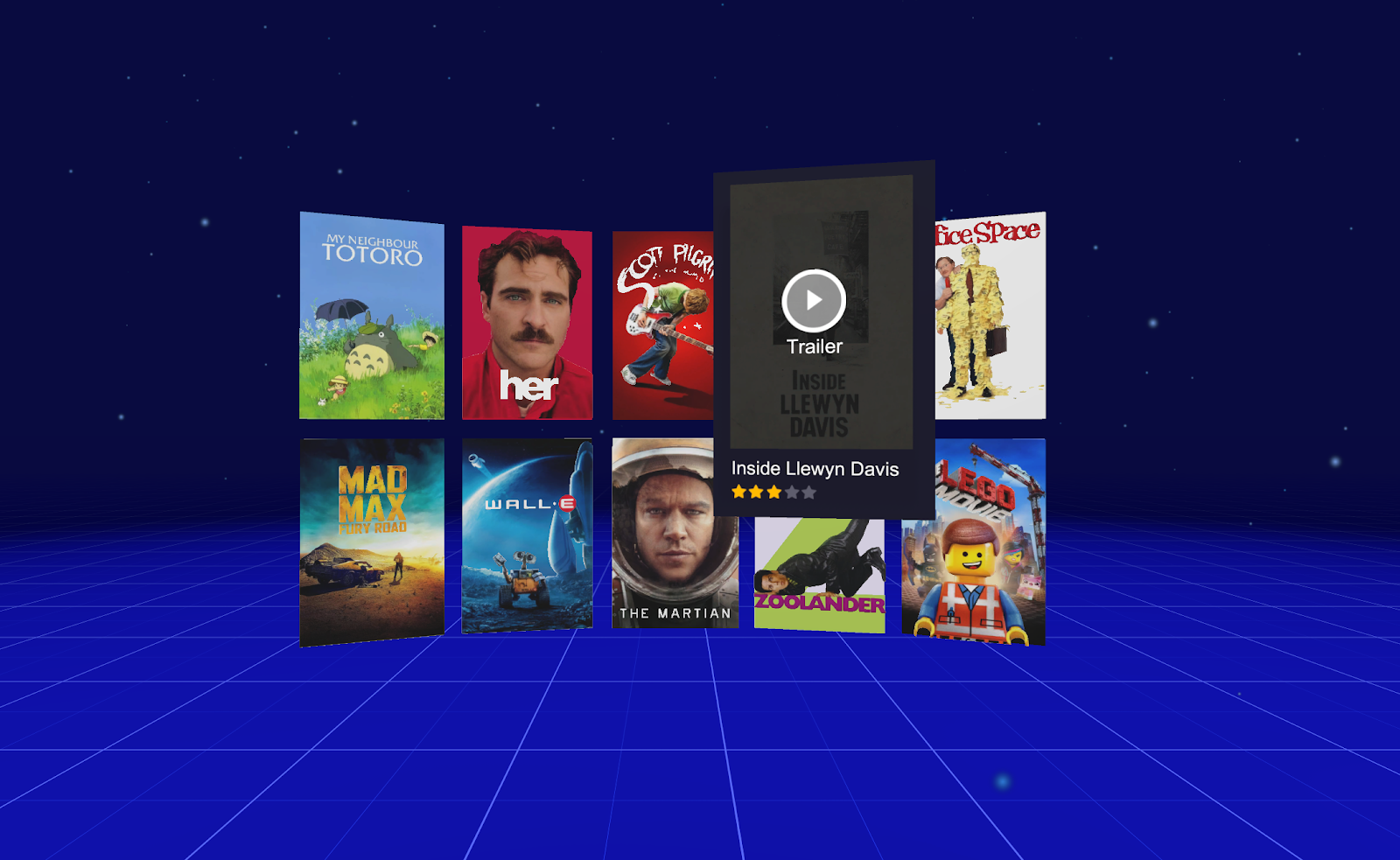
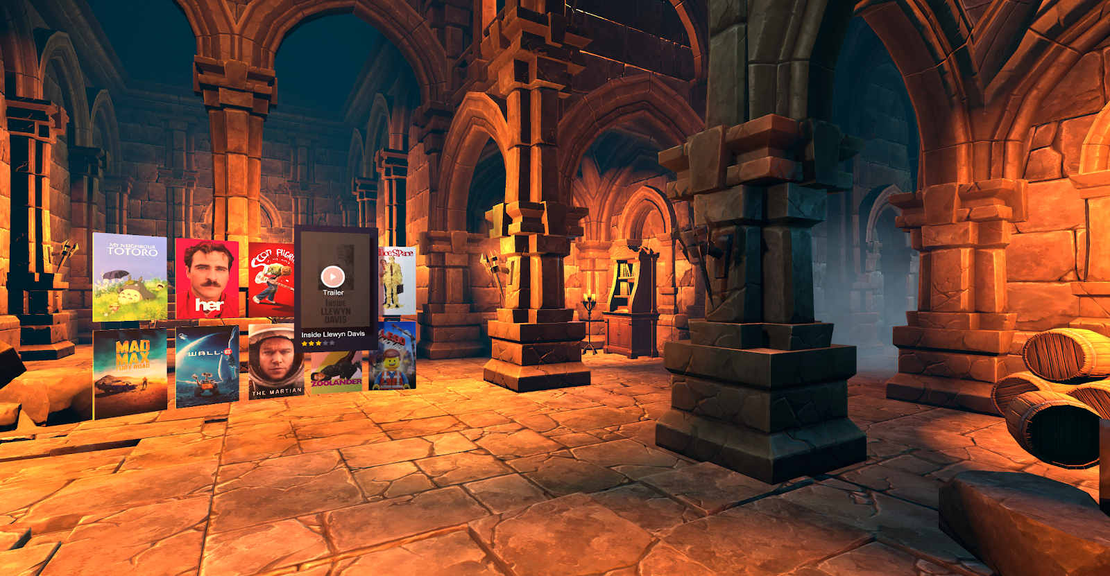
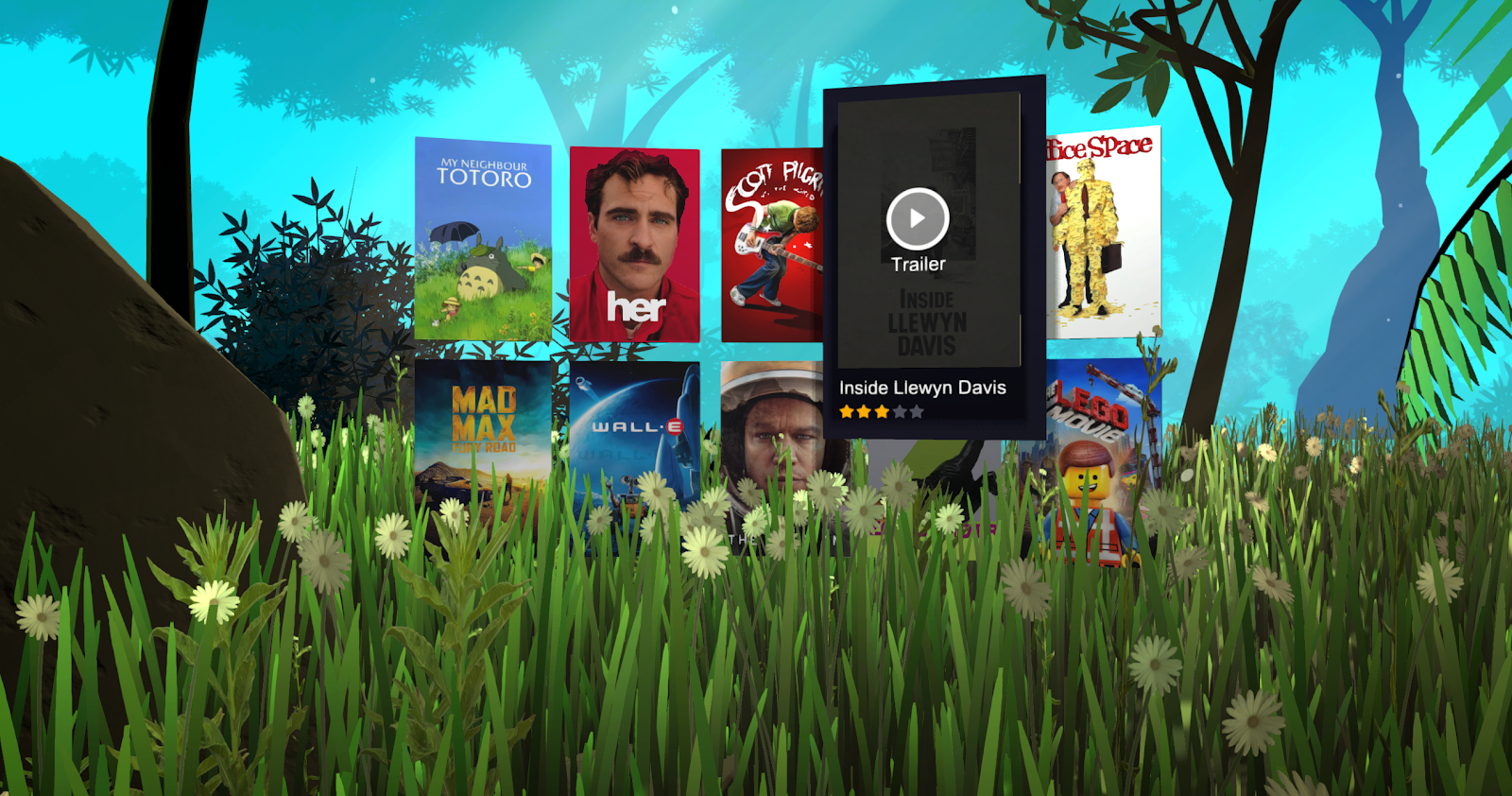
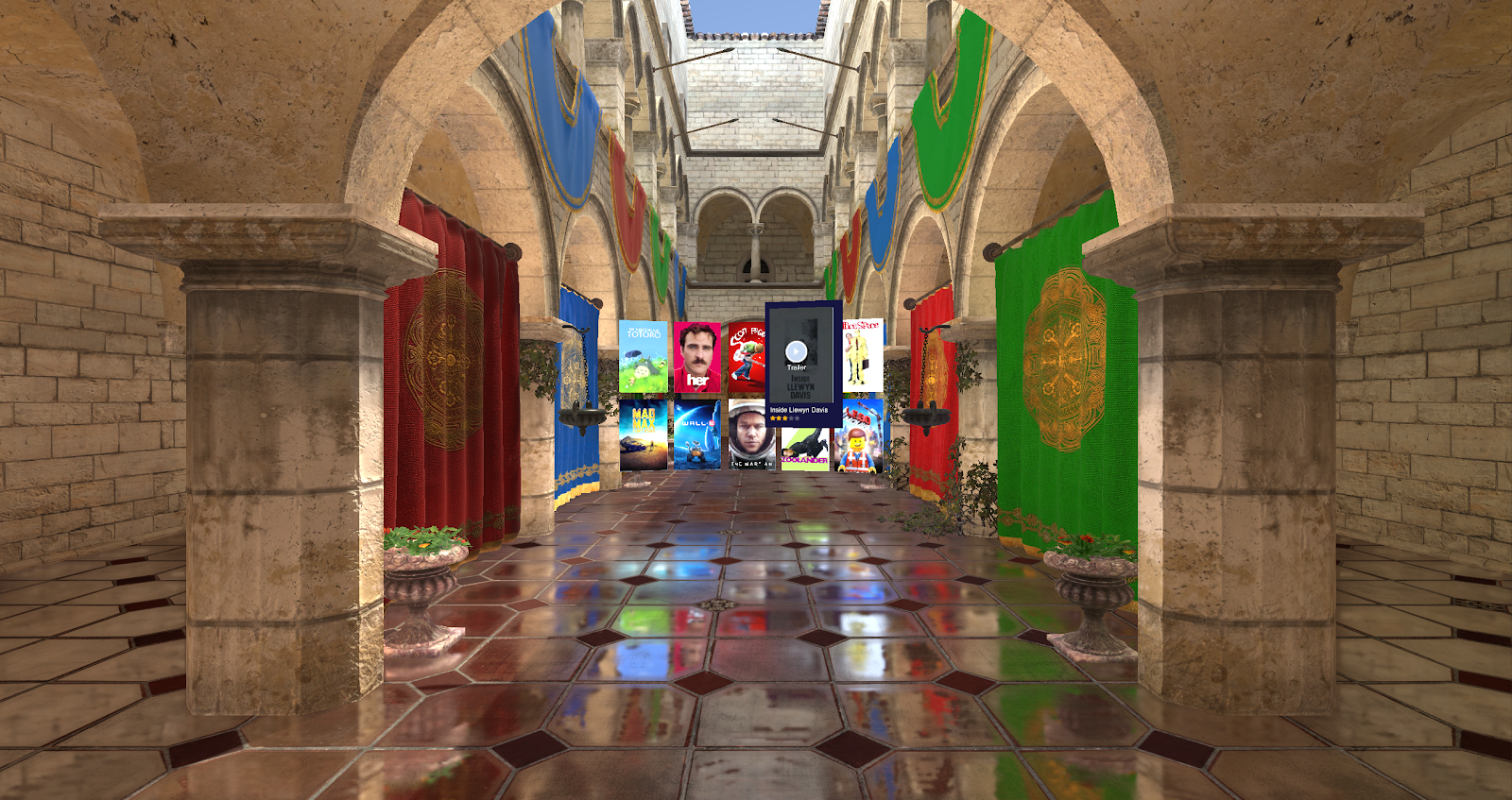
We worked on many iterations of the Play Movies environment. The first obvious test was to build a movie theater. We quickly found that it wasn’t fun to sit in a giant empty theater, many people even found it creepy. Instead we leaned back on our principles of open natural spaces. We created a museum of film that included props and elements from our favorite movies. Outside in the distance you can see a field and a big tree. When you pick a movie to play, you find yourself under this magical tree watching the movie outside, under the stars.
Connecting worlds with the Play environment
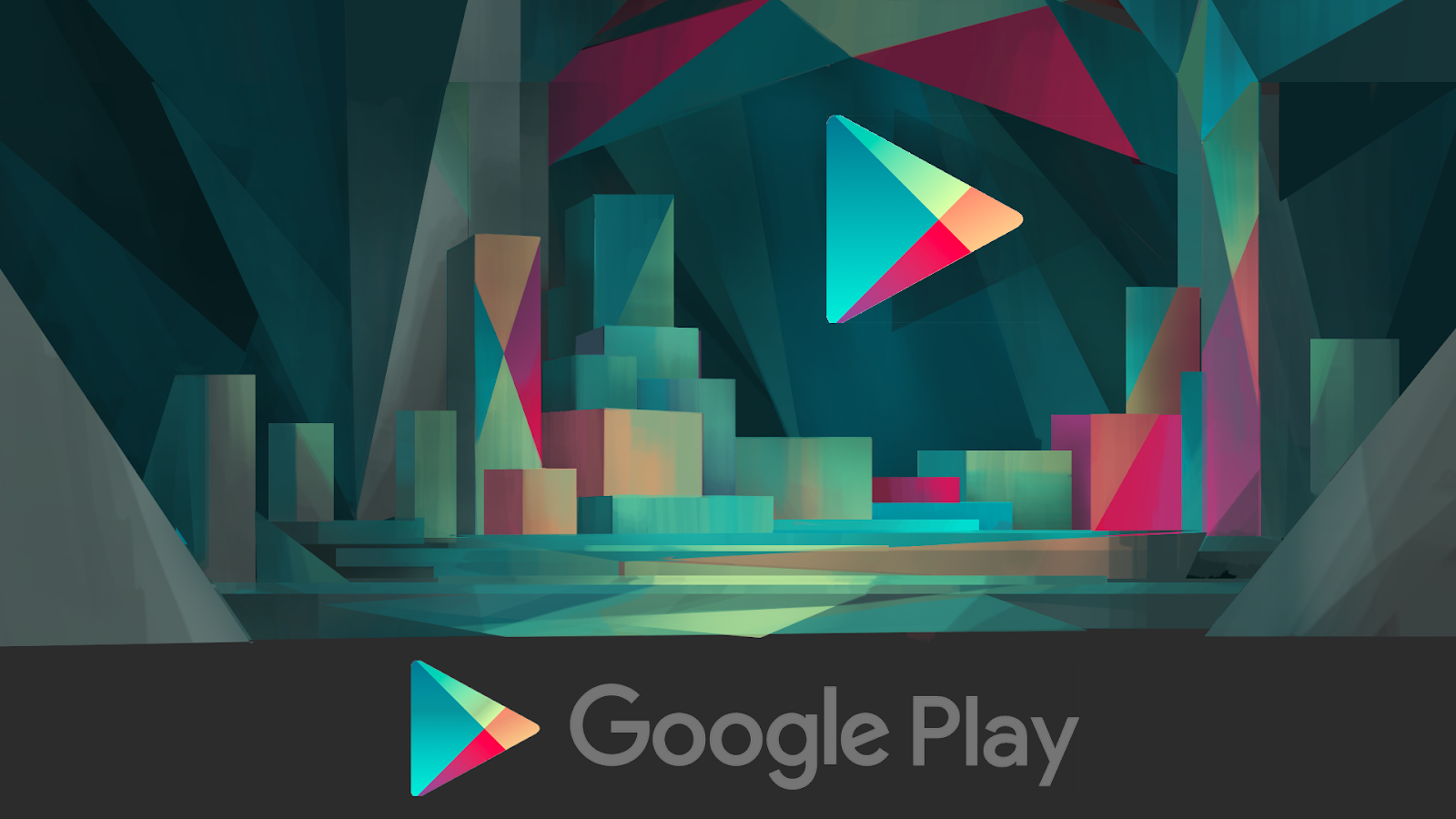
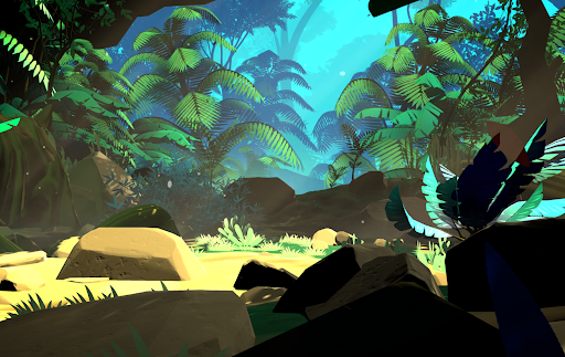
The main Daydream world and the Play store world needed to feel very connected. The user can quickly jump between these applications and they both need to feel like part of the OS. When in the home world just behind the user you can see an entrance to a magical cave. When the user clicks on the Play Store, they find themselves in that cave, which shares the same render style. It is filled with glowing magical crystals along with a continuation of the river that flowed through the home world.
The perfect museum for Google Arts and Culture
The Arts and Culture application was one of the best launch apps. Allowing you to explore in great detail most of the worlds most famous works of art. This environment was similar to the play movies, as it was a highly open and nature filled indoor space, this time overlooking a vaguely European city and countryside.
Creating a garden paradise for Google Photos
The Google Photos application also followed the style guide by creating a highly outdoor / indoor space. This time it even had plants and green spaces inside. It had a prominent wall where the UI would live, which became a common theme in most of our environments.
Helping research the future of VR environments with Google Seurat
Rendering on in VR is difficult on any machine, doing it on a phone is very challenging. I discovered a small research team within Google developing a technology they called LDI. This would allow environments with infinite detail to be rendered on even a basic smartphone. The technology was at an early stage but it had promise. I joined the group in a 20% capacity to be their artist and test case. I developed dozens of environments to test the LDI tech and gave lots of feedback and ideas on how to improve the final product. The examples I made were used to debut the product at Google IO. Eventually the technology was used by ILM to create an impressive Star Wars demo that could run on mobile VR.
Creating environments for prototype apps
After the launch of Daydream I joined a group that was focused on prototyping social applications. We build several high quality prototype apps and among my UI work I also developed all the 3D assets for these apps including the environments, players, props, etc. These needed to be extremely performant, but also be created and updated quickly.


