Creating a new design language
My first task when I joined Google was to quickly determine if a compelling “high end” VR experience could run on an Android phone. A small team of 4 were tasked with creating and end to end vision for what “smartphone VR” could look like and we developed the initial plan for Daydream. Once the project was made official I lead design for our Daydream OS and many of our launch applications. My role was to prototype, design and test what would become the core interactions, elements and design for Google VR.
Creating the building blocks of VR
VR was completely different from anything that had come before. Many of the design patterns that worked for websites, apps and games did not work in VR. The core challenge developing the Daydream OS was developing a new language for VR design. Simple things like buttons, pagination, scrolling, font sizes, selection, hovering, etc, all needed to be rethought. A team of around 6 designers joined together to write the rules for VR design. We did it by relentlessly prototyping and testing everything. These patterns were more than just the building blocks for our own Daydream OS, they would go on to become the tools that all VR developers could use on Daydream and other VR platforms.
Rapid prototyping with Unity
While it is possible to develop VR ideas on paper and in traditional design apps, nothing comes close to seeing it in VR. Nearly every concept out of the hundreds I developed were done entirely in Unity. This allowed me to rapidly experiment with field of view, ergonomics, readability, presence, tone, etc. It also allowed to too easily drop the headset on anyone to get feedback. Later in the process my skills with Unity allowed me to help develop production elements such as models, textures, shaders, UIs, animations, etc.
Parallax tiles and jumping into worlds
The magic of VR is the feeling of really being there. Many of the best Daydream apps were all about taking you somewhere special. I developed a concept for our promoted tiles that made them feel like windows to another world. For our app icons, I gave them depth that made them feel like physical objets. These design principles were used throughout the Daydream UI.
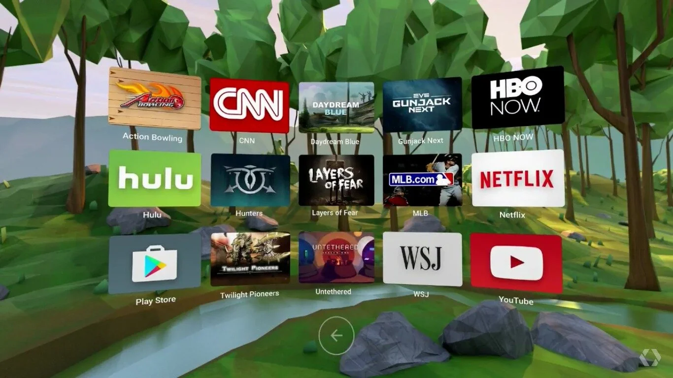
App library page
This screen allows you to view all your VR apps. While it may seem like a simple design exercise, it had many challenges. I developed a unique 3D scrolling technique that became the basis of all scrolling and pagination on Daydream.
VR keyboard
You may not notice it but the Android keyboard is an amazingly complex bit of software. I was tasked with designing our VR keyboard, which quickly grew into a huge project. This keyboard was used in both Daydream and our other VR applications.
Icons, images and developer guidelines
Creating interesting icons, images and environments while prototyping is very different from thousands of developers creating them for you. The assets that we needed to make Daydream work are very different from what developers were experienced making. I worked closely with key partners to ensure that our OS and developer guidelines were worked for them. I also personally made over 100 app icons as examples to prove out that the system works. I developed Unity apps and easy to use texture guidelines where developers could create their artwork and easily test it in VR.
VR play store
The Daydream home, settings and library screens were just the beginning. Using many of the core elements I took on the design for the VR Play store. This was our most UI intensive VR application and it required further developing UI paradigms. Learn more about my Play Store work here.
I was one of the leading advocates of VR at Google
I have a real passion for VR and I came to work so excited for everything we were working on. Because of my enthusiasm and my skill for presenting I became our defacto VR advocate. This meant regularly demoing and explaining VR to Google leadership and special guests. It also meant representing Google and Daydream at many VR conferences.


